

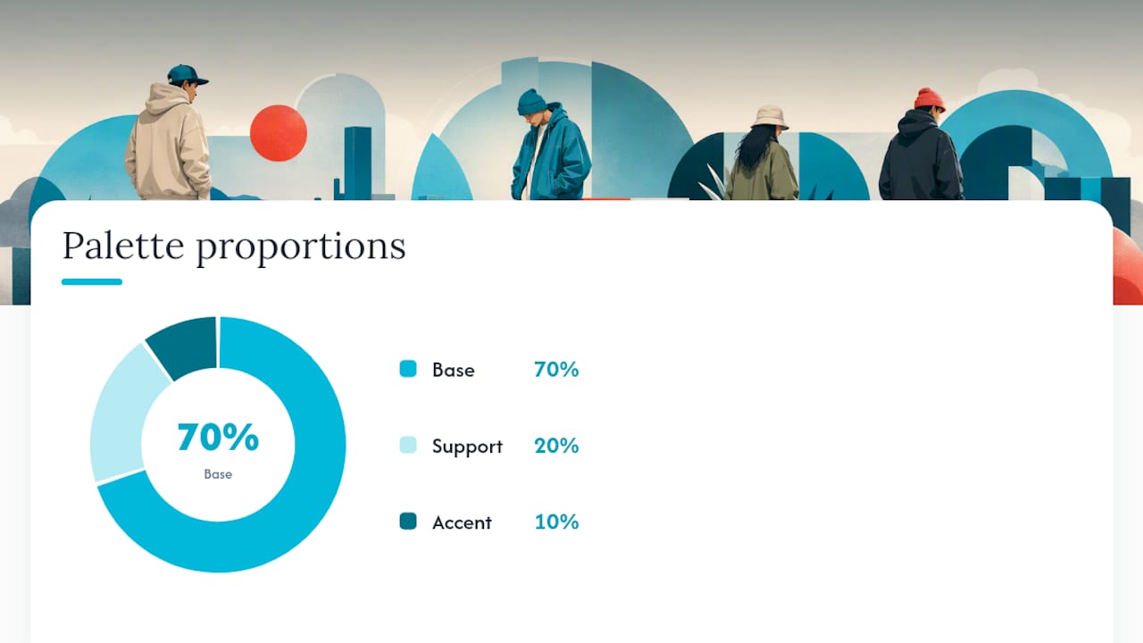
The fastest way to make any streetwear outfit look put together is a neutral base, one support color, and a single saturated accent: the classic 70/20/10 split. Anchor with black, cream, or washed denim, layer in an earth tone or tonal neutral, then let one piece (jacket, cap, or sneaker) carry the color that actually pops. Eight ready-to-copy palettes follow below, from tonal minimalism to a black-and-red cinematic look built for cooler months.
TL;DR:
- Using one dominant neutral, a supporting mid-tone, and a single accent color creates cohesive streetwear outfits that are easy to style and photograph well.
- Placement of colors is crucial; saturated accents should be limited to one zone, such as footwear or accessories, to avoid visual clutter and overexposure.
- Building a wardrobe with foundational neutrals and rotating a single, season-appropriate accent piece ensures longevity and adaptability across trends.
- Styles and color schemes should reflect mood signals, with black and red conveying night-edge and pastels or earth tones suggesting approachability and groundedness.
- Texture and fabric choice significantly affect how colors appear in photographs, making varied materials essential for depth and color accuracy in outfits.
Table of Contents
- 8 Streetwear Color Combinations You Can Copy Today
- Complementary, analogous, and monochrome: the theory behind the fit
- Where color goes on your body, and how it reads on camera
- Four Color Mistakes That Make an Outfit Look Off
- Outfit Formulas Worth Copying, and What to Buy First
- Styling Notes From Robert at Imuskop
- Building Palettes Around Seasonal Shifts
- Why the Same Color Looks Different in Cotton, Fleece, and Nylon
- Working Prints and Graphics Into a Color Palette
- What Your Color Choices Say Before You Say Anything
- An Honest Take on Trend Chasing vs. Building a Real Rotation
- Build Your Palette With Pieces That Already Match
- Sources
8 Streetwear Color Combinations You Can Copy Today
Streetwear color schemes work best when they’re borrowed, not invented from scratch. These eight cover the range from quiet-luxury minimalism to loud, camera-ready contrast.
- Minimal tonal gray. Charcoal hoodie, mid-gray joggers, and off-white sneakers. Nothing competes; this reads as expensive even when it isn’t. Works for daytime errands or studio shots where you want the graphic on your tee to be the only focal point.
- Earthy utility. Olive jacket, tan cargo pants, rust-colored beanie as the accent. This is a workwear-adjacent look that photographs well outdoors, especially in fall light.
- Black and red cinematic. Black everything, one red accent piece (bomber, laces, or a crossbody bag). This is the highest-contrast palette on the list and it reads best at night under streetlight or neon signage.
- Cream and pastel streetpop. Cream base, baby-blue or lilac hoodie, white sneakers. Soft, low-stakes, good for daytime social content where you want a friendly, approachable vibe rather than an aggressive one.
- Washed navy and rust. Faded navy denim, rust or burnt-orange overshirt, tan boots. A cooler-weather combo that leans into the olive, mustard, and burnt orange direction editors flagged as a defining 2025 streetwear signal, making it a legitimate 2026 trend pick.
- Olive, charcoal, and orange accent. Olive joggers, charcoal tee, single orange accessory (hat or bag strap). Versatile enough for both daytime and indoor shoots with warm lighting.
- Monochrome gray family. Three shades of gray layered together, no accent color at all. This is the safest option when you’re not sure what else you own will match, and it never clashes with a graphic tee.
- Neon accent, neutral base. All black or all cream, with one neon green or acid-yellow piece. High risk, high reward. This pairs with the color directions trend forecasters are tracking for 2026, but it’s the one combo where restraint matters most.
Complementary, analogous, and monochrome: the theory behind the fit
Color theory sounds academic until you realize it’s just a shortcut for “why does this outfit look right.” Three relationships do most of the work in streetwear.
Complementary pairs colors from opposite sides of the wheel, like navy and rust or black and red. It’s the loudest option and works when you want one outfit to be the whole statement.
Analogous combos sit next to each other on the wheel, olive with mustard, or navy with teal. These read as cohesive without trying hard, which is why they show up so often in earth-tone streetwear.
Monochrome uses one color family in different values, three grays, or three shades of tan. It’s the easiest palette to get right on a bad morning because nothing has to match, it just has to blend.
The 70/20/10 rule maps directly onto your closet. Editors who build cohesive streetwear fits tend to anchor with one dominant color and cap accents to a single zone rather than spreading them across the outfit.
Here’s a three-step recipe for building a palette from clothes you already own:
- Lay out everything neutral you have (black, white, gray, tan, olive) and pick one as your base.
- Choose one mid-tone piece for support that either matches or sits analogous to the base.
- Pick exactly one accent color and put it on only one item, never two.
Pro Tip: If you’re not sure whether a color counts as an accent or a second base, ask whether you’d still wear the outfit if that piece were plain black. If yes, it’s an accent.
Where color goes on your body, and how it reads on camera
Placement decides whether a combo looks styled or accidental. Your base colors, pants, outerwear, layering pieces, take up the most visual real estate, so they should be your calmest colors. Your tee or hoodie is the support zone. Your accent, almost always footwear, a cap, or a bag, gets the boldest color you own.
- Keep saturated color to one zone; two saturated pieces fight for attention and split every photo.
- Off-white and cream photograph with more texture and detail than pure white, which tends to blow out under phone camera exposure.
- Textured black (waffle knit, brushed cotton) holds shadow detail better than flat, matte black, which can look like a void in flash photography.
- Shoot in open shade or during golden hour; direct overhead sun flattens color and creates harsh accent-color glare.
- Check your shot on the actual phone screen before you commit. What looks fine to your eye can still overexpose a neon accent.
Colors genuinely behave differently once a camera sensor gets involved. Saturated neons can oversaturate and lose detail entirely, while creams and textured blacks tend to hold up better across lighting conditions than their pure white or flat black counterparts. That’s a big part of why so many “clean” streetwear fits lean cream and charcoal instead of stark white and jet black.
Four Color Mistakes That Make an Outfit Look Off
- Two loud accents competing. A neon jacket plus neon sneakers cancels both out. Fix: pick one accent zone and mute the other.
- No base color at all. An outfit built entirely from mid-tones has nowhere for the eye to rest. Fix: add one true neutral, black, cream, or gray, before anything else.
- Matching instead of coordinating. Wearing the exact same shade top to bottom looks costume-like. Fix: shift one piece a shade lighter or darker.
- Ignoring texture. Two flat matte pieces in the same color read as flat on camera. Fix: mix a textured piece (denim, corduroy, waffle knit) into the same-color pairing.
Quick pre-leave check: neutral base confirmed, one support color, one accent zone, and at least one textured piece in the mix.
Outfit Formulas Worth Copying, and What to Buy First
- Black tee, olive cargo pants, tan boots, black cap.
- Cream hoodie, washed denim, white sneakers, no accent needed.
- Charcoal tee, gray joggers, single neon-green sneaker accent.
- Graphic tee, navy joggers, rust overshirt tied at the waist.
Build palette flexibility by buying in this order: neutral bottoms first (black or olive), one statement jacket, one accent accessory, then a versatile sneaker in white or gray. Limited or hyped sneaker colorways drive resale premiums, which is exactly why a neutral, easy-to-match pair matters more for everyday palette flexibility than a rare drop does. For more on how tees and sneakers pair up, Muskop’s shirt-and-sneaker matching guide covers the specifics.
Styling Notes From Robert at Imuskop
I’ve spent years watching what actually gets reposted versus what just gets bought and forgotten, and it’s almost always the same rule: one dominant color, one support, one accent. Imuskop’s tee-and-sneaker coordination guide and matching tips roundup both build from that same 70/20/10 logic, because it’s the one thing that keeps a graphic tee from getting visually drowned out.
Building Palettes Around Seasonal Shifts
Streetwear color schemes shift with the calendar more than most people admit. Spring and summer favor lighter values and higher contrast: cream, white, pastel blue, and washed denim as bases, with brighter accents like acid green or safety orange that don’t feel heavy under direct sun. These palettes photograph well outdoors because lighter bases don’t absorb heat visually the way charcoal or black does, and pastels read as fresh rather than muddy in bright daylight.
Fall and winter pull the palette down into earth tones and deeper neutrals: olive, rust, burnt orange, charcoal, and washed navy. These colors work partly because they match the actual environment, dead leaves, gray skies, longer shadows, and partly because heavier fabrics (wool, fleece, waxed cotton) hold saturated color differently than summer’s lighter cottons and mesh.
The practical shift is smaller than people think. You’re not buying a new closet every season, you’re rotating which piece carries the accent color and adjusting your base from light neutrals to darker ones. A cream base in July becomes a charcoal base in December, but the 70/20/10 structure underneath stays exactly the same. If you build your first few outfit formulas with that structure in mind, the seasonal switch is just a swap of a few key pieces, not a full rebuild.
Why the Same Color Looks Different in Cotton, Fleece, and Nylon
The exact same shade of black looks like three different colors depending on what it’s printed or woven on. Matte cotton absorbs light and reads as a soft, slightly muted black. Fleece has more surface texture, so it catches shadow and looks deeper in photos, even under flat lighting. Nylon and other shiny synthetics reflect light directly, which can make the same black look almost gray in a photo taken with flash or under bright sun.
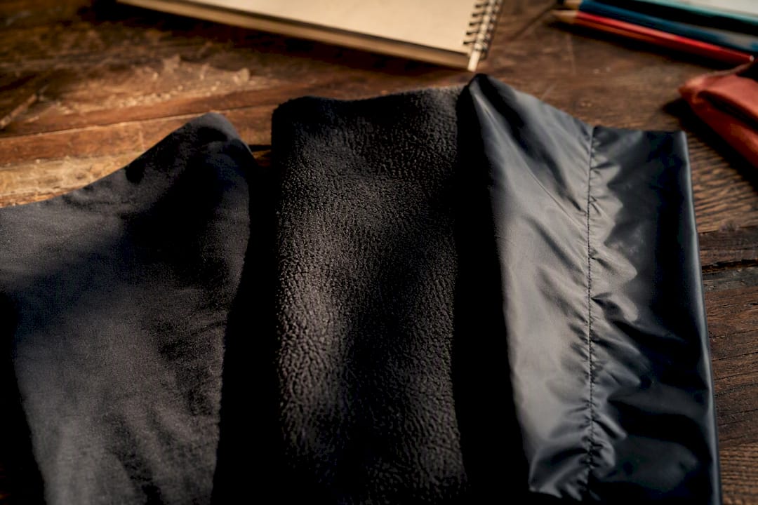
This matters most when you’re trying to build a monochrome or tonal outfit. Two “black” pieces in different fabrics rarely match perfectly under real light, and that’s fine. It actually adds depth to a monochrome look instead of flattening it. The mistake is expecting a cotton tee and a nylon jacket in the “same” navy to look identical once you step outside.
Texture also affects how bold an accent color reads. A saturated orange in smooth cotton looks flat and graphic. The same orange in a brushed or ribbed fabric looks richer and less like a swatch. If you’re building a palette around one accent piece, consider the fabric as part of the color choice, not separate from it.
Working Prints and Graphics Into a Color Palette
Graphic tees are where most streetwear color plans fall apart, because a busy print effectively becomes your support color, not just a pattern sitting on top of a neutral. The move is to treat the dominant color inside the graphic as if it were a solid piece of clothing when you’re building the rest of the outfit.
If a graphic tee has a red and black design, that tee is your support and accent combined, which means the rest of the outfit needs to go quiet: neutral bottoms, neutral outerwear, no competing color anywhere else. This is the single most common fix when a graphic-heavy outfit looks cluttered instead of intentional.
Camo, plaid, and tie-dye follow the same logic but need one more step: pick the least saturated color in the pattern and use that as your bridge to the rest of the outfit. A rust-and-olive camo jacket pairs cleanly with plain olive pants because you’re matching to the pattern’s quietest tone, not its loudest one. Trying to match the loudest color in a print almost always creates a second competing accent, which circles back to the most common mistake covered earlier.
What Your Color Choices Say Before You Say Anything
Color reads as mood whether you plan it or not. Black-dominant outfits tend to signal seriousness, edge, or a deliberate low profile, which is part of why the black-and-red cinematic palette works so well for night looks. Cream and pastel combinations read as approachable and low-stakes, which is why they dominate daytime, casual social content.
Earth tones (olive, rust, tan) carry a grounded, utilitarian mood, borrowed visually from military and outdoor gear, even when the actual garment has nothing to do with either. Neon accents against a neutral base signal energy and confidence, but only in small doses; a full neon fit reads as costume rather than styled.
None of this means you need to overthink every outfit as a mood statement. It means the palette you reach for on a given day is already doing some of the talking, so it helps to know what it’s saying before you post it.
An Honest Take on Trend Chasing vs. Building a Real Rotation
Most advice on streetwear color combinations treats each new season’s trend palette as something to buy into fresh, and that’s where I think the conventional approach gets it backward. Trend-forward colors like burnt orange or acid green work best as one accent piece layered onto a wardrobe you’ve already built around neutrals, not as a full outfit to chase every few months.
The palettes that actually last are the ones anchored in colors that photograph consistently: cream over pure white, textured black over flat black, olive over neon. Readers who prioritize the base and support colors first, then rotate a single accent piece with the season, end up with a wardrobe that photographs well year-round instead of one that looks dated by the next trend cycle.
— Robert
Build Your Palette With Pieces That Already Match
Imuskop’s graphic tees are built to slot into exactly the palettes above, whether you’re anchoring a monochrome gray fit with a bold statement graphic or letting an earth-tone outfit carry a print as its accent color. Instead of guessing which color family a new tee will clash with, Imuskop’s designs are made to work as either your support piece or your loudest accent, depending on how you style them.
Free shipping and interest-free payment options through Affirm make it easier to build out a few key pieces at once rather than one at a time. If you’re ready to fill in your base, support, or accent zone, browse the current graphic tee collection and start building your rotation around a print you’ll actually keep wearing next season.
Sources
- The hype machine: Streetwear and the business of scarcity
- Best streetwear color 2025 — Complex
- 2025 streetwear color trends — Hypebeast
Recommended
- American Express
- American Express
- American Express
- shop.app
FAQ
What is the 3 color rule in fashion?
A common approach is limiting an outfit to three colors total: a dominant neutral base, a supporting mid-tone, and one accent color placed on a single item like footwear or a cap. Keeping saturated color to one zone is what makes the combination read as planned instead of accidental.
What makes a woman look wealthy?
A calm, cohesive palette reads as expensive even when nothing is flashy. A tonal look, like a charcoal hoodie with mid-gray joggers and off-white sneakers, avoids competing colors and lets the outfit look put together rather than thrown on.
Why does the same outfit look different in photos?
Texture and fabric change how a color appears on camera. Off-white and cream pick up more texture and detail than pure white, which can blow out under phone camera lighting, so varied materials help keep colors looking accurate and give an outfit more depth.